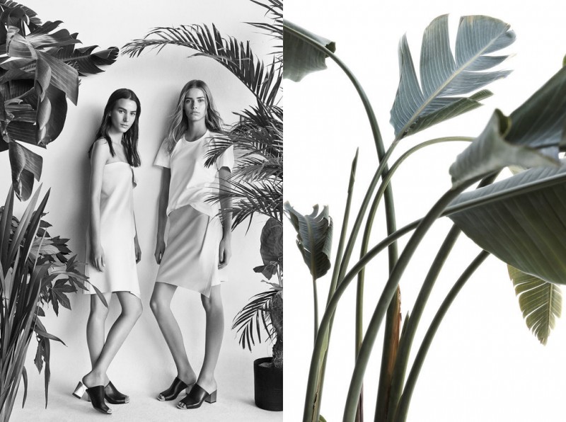
ZARA SPRING
2014
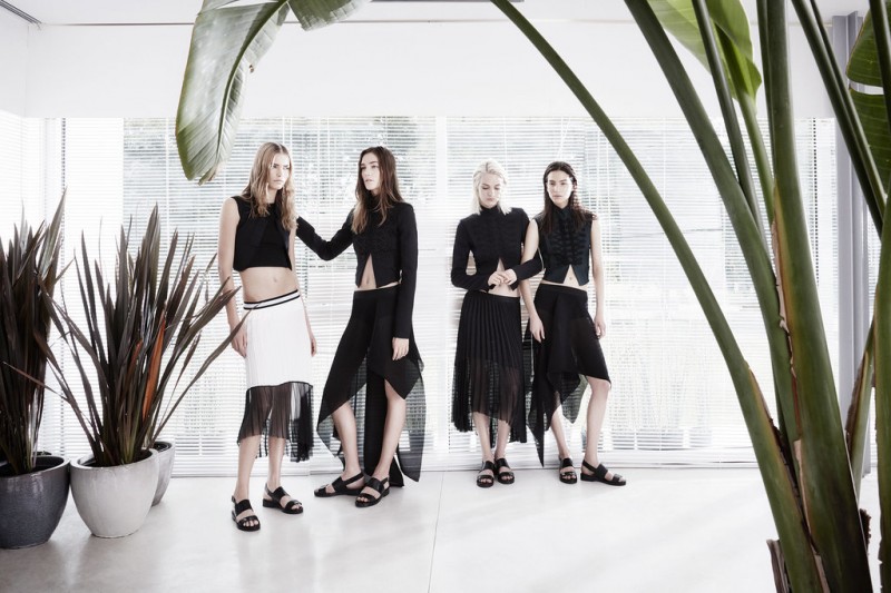
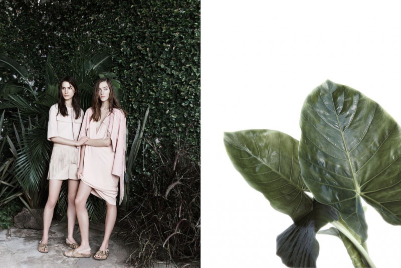
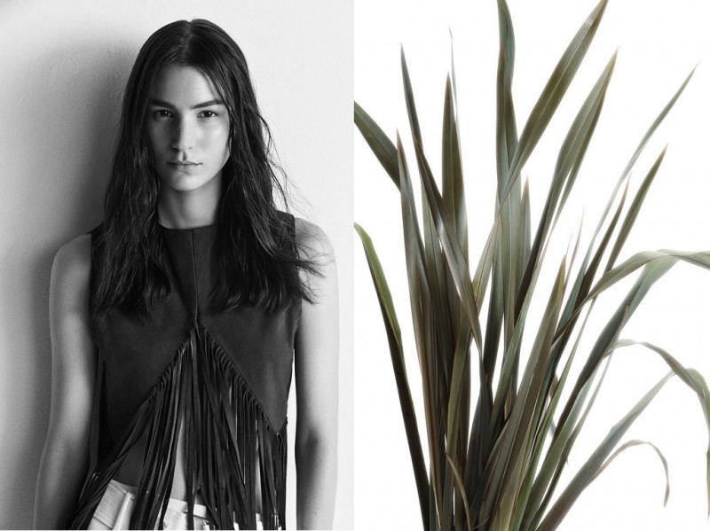
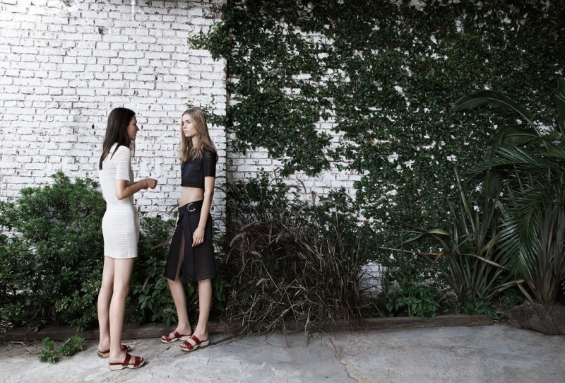
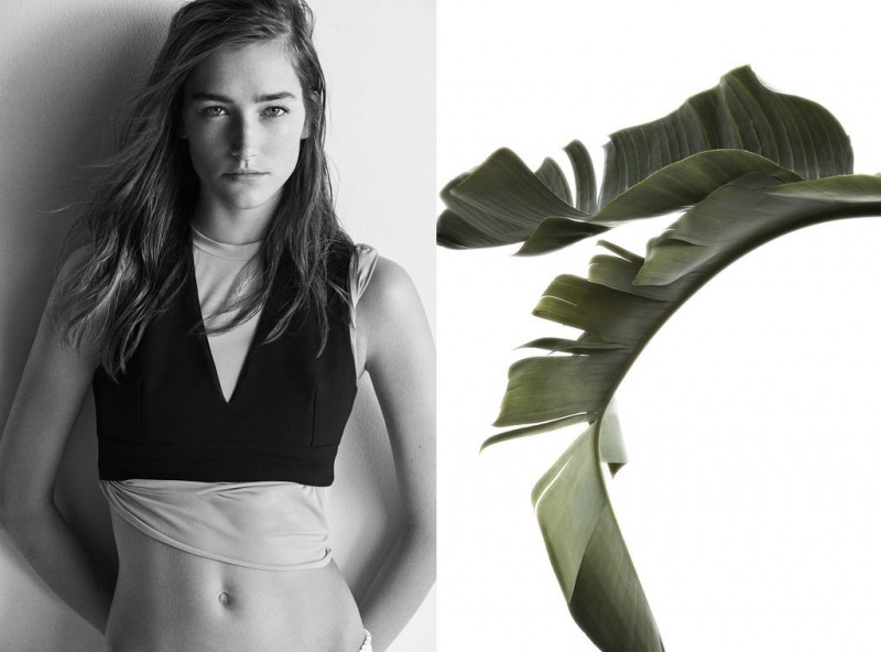
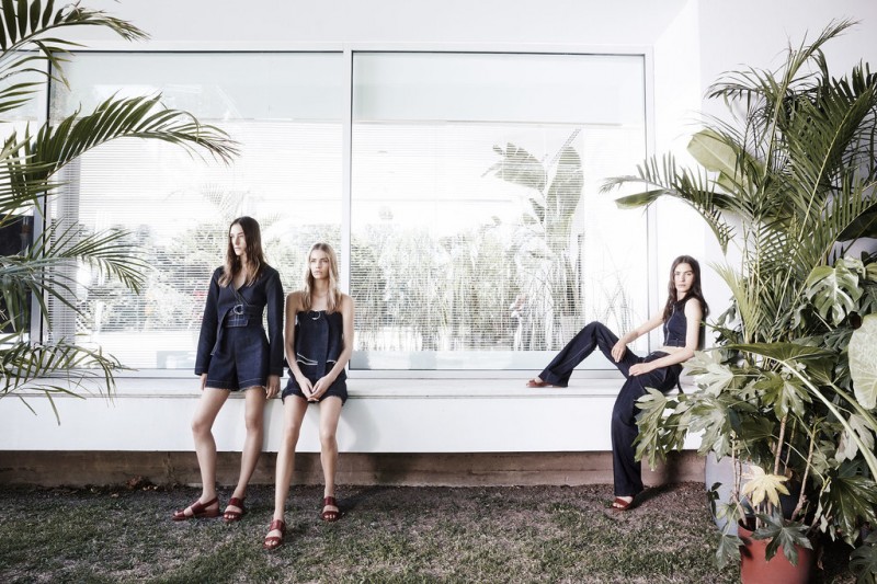
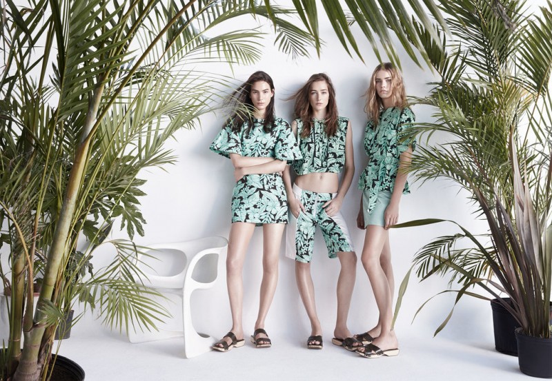
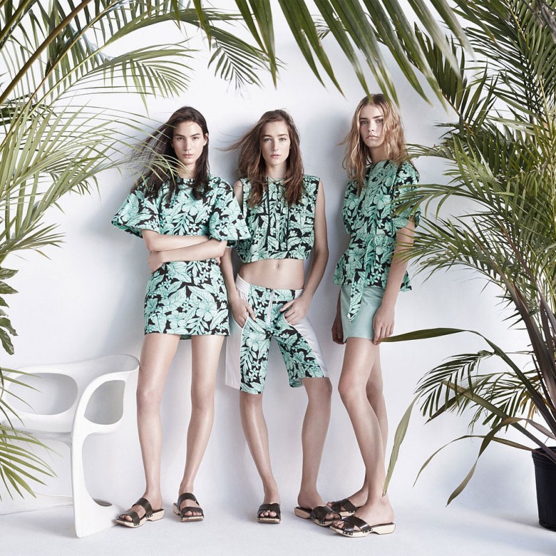
It’s not often that an ad campaign really sticks with me…in honor of throw-back-thursday, I wanted to include this Zara Spring 2014 Campaign in my new “Inspired By” category. I love the de-saturated greens of the palms, the mostly black and white photos with very small hits of color and I especially love that even though the framing of the images is quite full with sometimes very little white space, the whole campaign still has a minimal vibe and doesn’t feel busy. I’ve adored this lookbook since I first saw it, and even though its from seasons past, it still continues to inspire me…





digging this
thanks for sharing
x
e d i o t
I’m so glad you liked it !